Corporate Design of Euro Disney Resort – Part 2
In the first installment of this series on the corporate design of the Euro Disney Resort, we described how Euro Disney’s logo and company colors looked like. Now, we’re going to explain when they were introduced, where they could be found in the Park and throughout the Resort and why they didn’t became a success.
The corporate design of the Euro Disney Resort was described in a ‘graphic standards manual’.
The Euro Disney Graphic Standards Manual
A graphic standards manual describes all the ways in which a company's logo and colors can be used. In order to establish a strong identity, these guidelines must be followed consistently and correctly in any form of communication in which the logo and house colors appear.
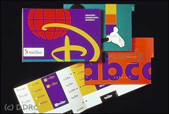
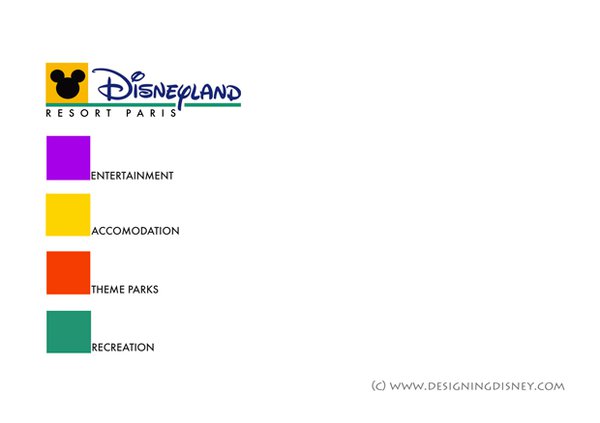
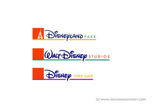
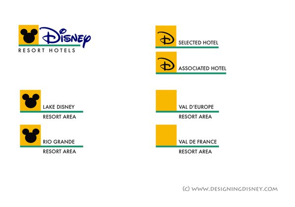
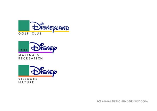
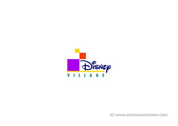
S/P wanted to deliver a flexible system – a ‘kit of parts’ – that was easy for anybody at Disney to use. Therefore, the Euro Disney Graphic Standards Manual allowed people to rearrange and combine the different Euro Disney logos and colors in any possible way.
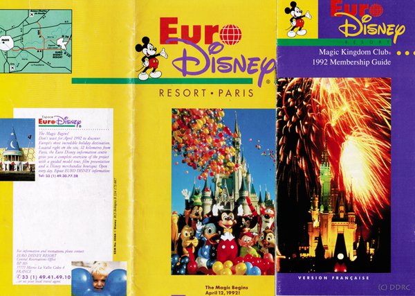
Examples of this flexibility can be found in the pre-opening brochures, where several variations of the company logo (side-by-side or stacked, featuring Euro Disney, Euro Disney Resort or Euro Disney Resort Paris) were often used in one and the same publication.
When was the corporate design introduced?
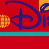
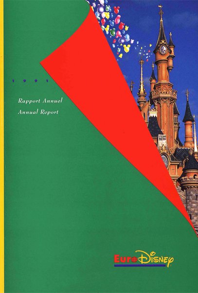
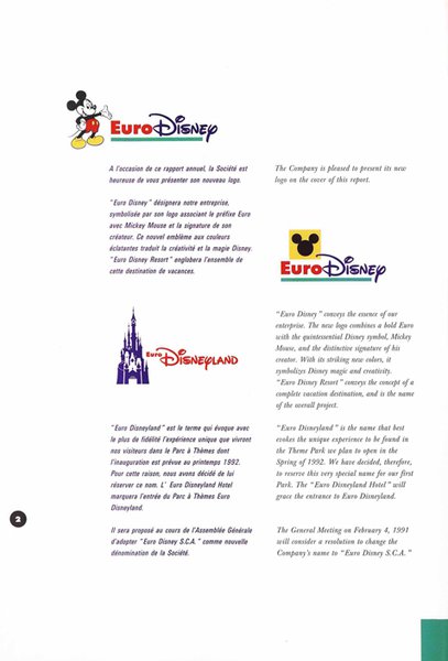
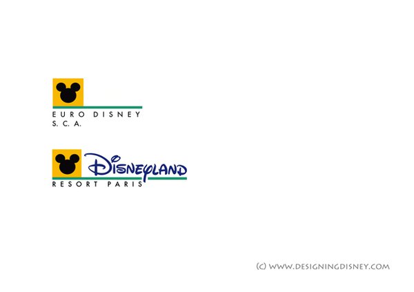
The new name, logo and company colors were all introduced in 1991 with the publication of the 1990 annual report of Euro Disney SCA. This document, designed by Dan H. Evans, showcases Euro Disney’s corporate design in its earliest and purest form.
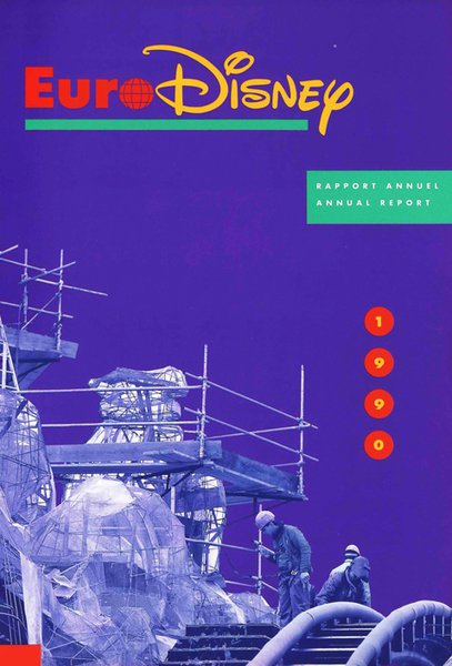
The cover of the annual report was tinted in purple. Although disliked by Evans, it featured a photo of the construction of the ‘Big Thunder Mountain’ attraction. The pages were adorned by boldly colored geometrical forms, silhouettes of Disney characters and letters in the Walt Disney font. In the document, one could find several variations of the company logo and name.
The use of bold colors and geometrical forms is characteristic for the work of S/P. There is a striking resemblance between the annual report and A.M. Stern’s ‘Euro Disney Preview Center’, although plans for that building were drawn way before the corporate design was established.
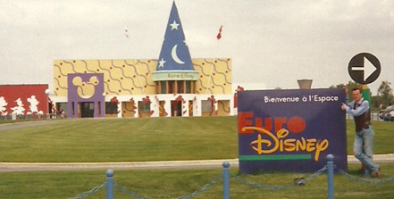
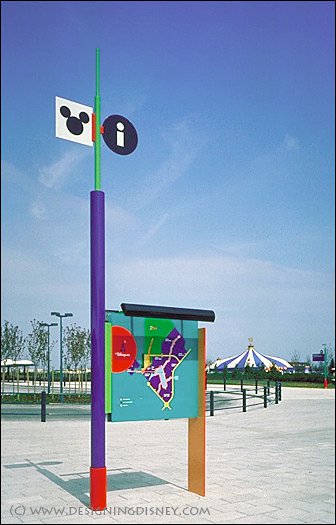
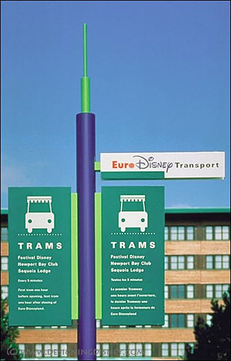
Where could Euro Disney’s logos and company colors be found?
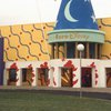
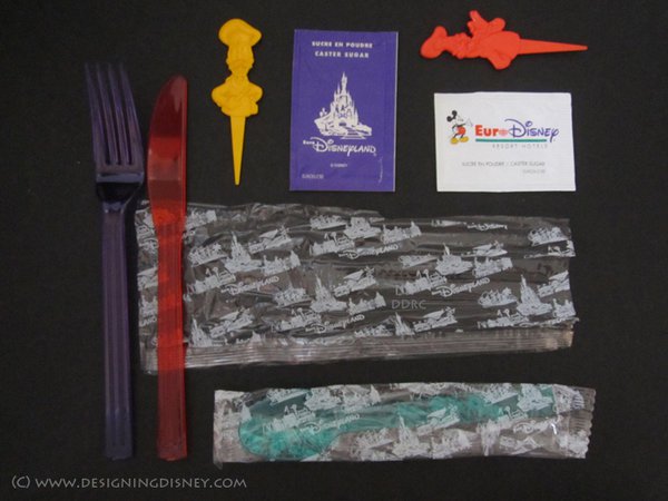
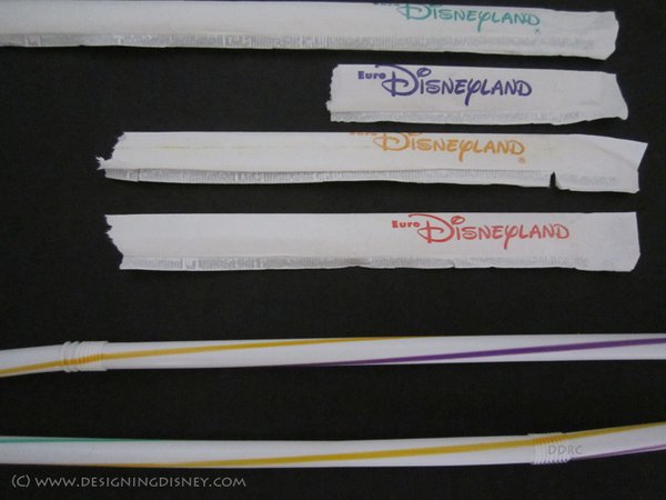
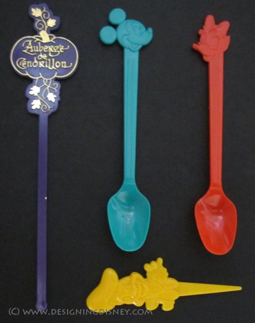
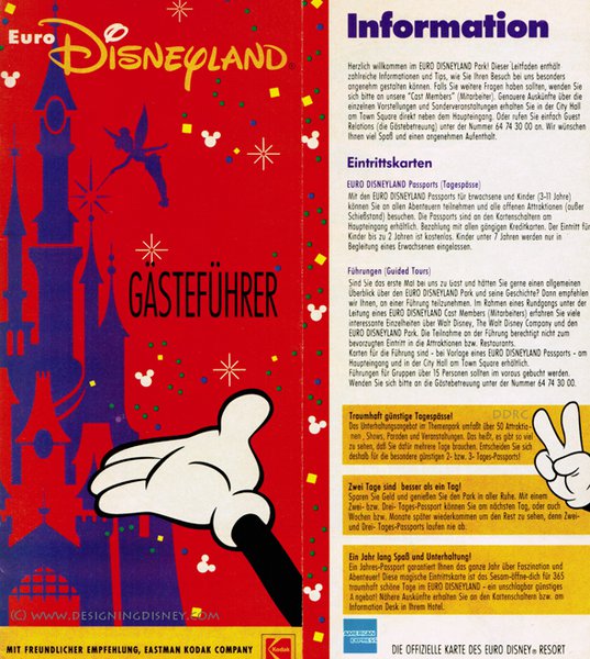
When the resort opened, Euro Disney’s logos and company colors could be seen everywhere. They were used on bags, stickers, cups, plates, napkins, plastic cutlery and souvenirs.
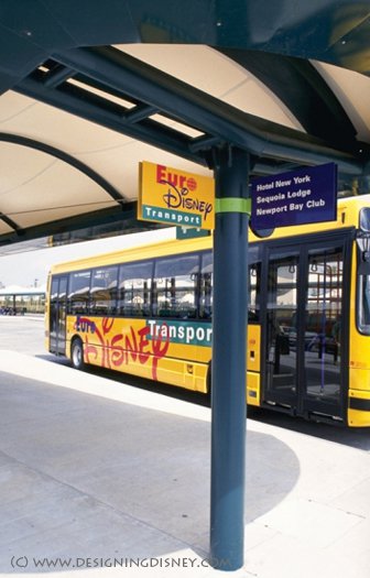
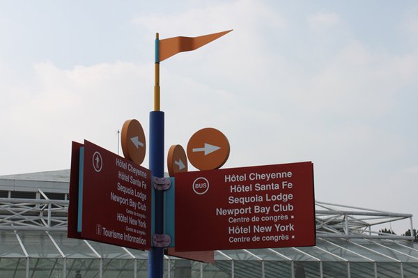
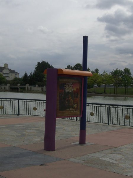
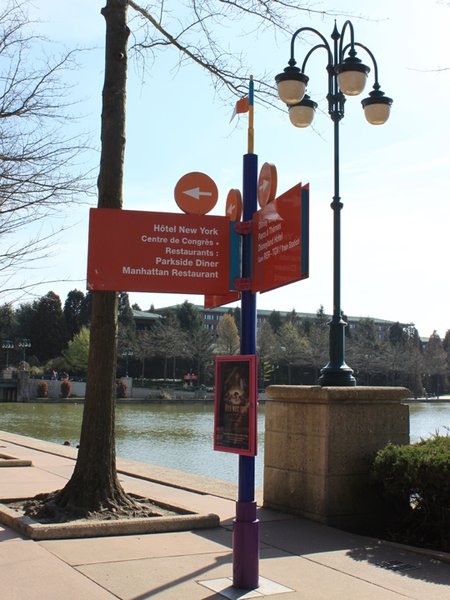
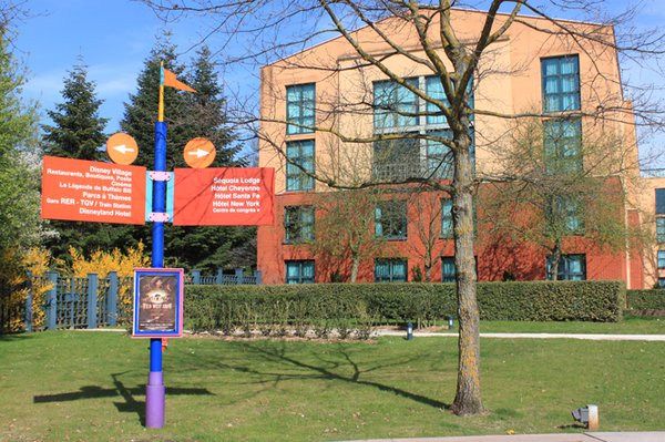
Even the resort wide signing system and the exterior graphics and interior finishes of the ‘Euro Disney Transportation’ busses were in sync with the original design.
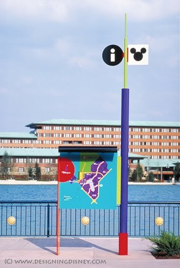
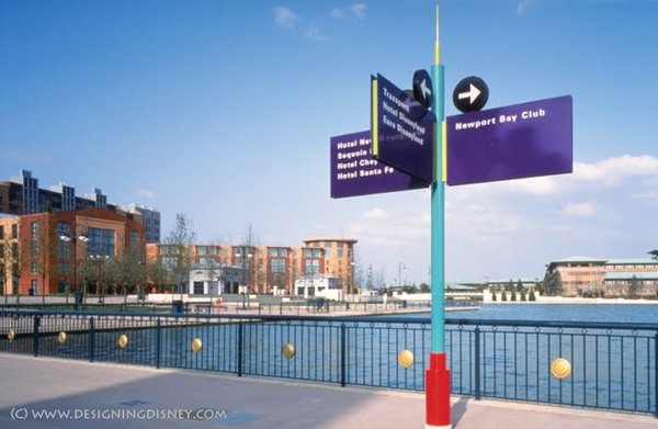
Most of the ephemera of the resort’s first days were probably designed by ordinary people following the Euro Disney Graphic Standards Manual. All examples mentioned above clearly show that the corporate design could be used for virtually every purpose.
Why did the corporate design fail?
In October 1994, the Euro Disney Resort was renamed ‘Disneyland Paris’ and the original logo and company colors were abandoned. There are a few reasons why Disney decided to do so.
The palette
Market research revealed that purple was perceived differently in Europe than in the United States. According to ‘ID Magazine’ (Euroclash, ID Magazine, January 1992, p.61), this color symbolizes death and crucifixion in a predominantly Catholic Europe.
“A significant example of purple failure is the initial design of Euro Disney's signs. The color palette was intended to rival Coca Cola's red, but the final selection of vast amounts of purple was a tragic mistake. Purple symbolizes death and the crucifixion in Catholic Europe. It's not surprising that visitors thought the signs were morbid. How did this happen? The CEO liked purple.”
Seen as purple had a significant negative connotation, its usage was drastically reduced in printed materials and throughout the resort after 1991. For example, the 1991 annual report of Euro Disney SCA has a green cover and much less purple.
The logo
As there were all these valid versions of the Euro Disney logo, it was clear that, to convey a strong, lasting image of the brand, there needed to be rules in place as to which logo should be used when and where.
The Euro Disney Graphic Standards Manual featured some rules as to when to use the logo with the image of Mickey Mouse or when to use the logo with the yellow square and the silhouette of Mickey’s head and ears instead, but these rules were not clear nor any way near sufficient.
In the end, as no one knew which logo to use when, all versions where used indiscriminately which devalued the logo as such.
And the name?
The name ‘Euro Disney Resort’ was regarded a failure too. The terms ‘Euro’ and ‘Resort’ both seemed to be too complex and abstract to communicate what the destination was all about. Michael Eisner (Work in Progress, Hyperion, New York, 1998) once said that:
“As Americans, [they] had believed that the word ‘Euro’ in front of Disney was glamorous and exciting. To Europeans, it turned out to be a term they associated with business, currency, and commerce. Renaming the [resort] “Disneyland Paris” was a way of identifying it not just with Walt’s original creation but with one of the most romantic and exciting cities in the world.”
To add to the confusion, many usages of the name were regarded as valid and again nobody knew exactly when to use which one.
Just as for the logo, there were some rules in place, but they did nothing to clarify things. Even Michael Eisner mixed up the different names during the opening ceremonies for the different parts of the resort.
However, many people still refer to Disneyland Paris as ‘Euro Disney’. It looks like the name has become common parlance, probably due to the fact that it was heavily promoted back in 1992 and that it is short and catchy (as is the term ‘Disney World’).
Today and Tomorrow
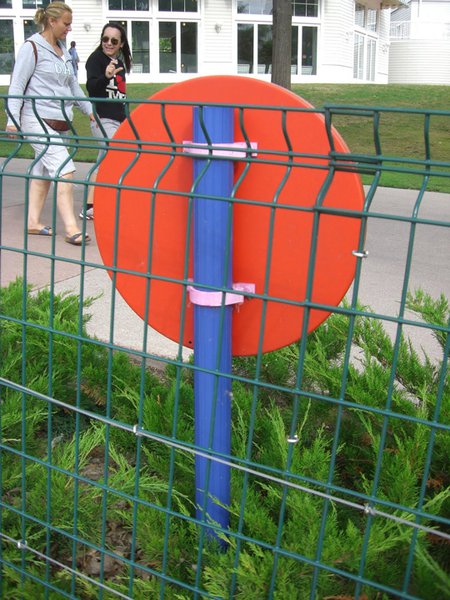
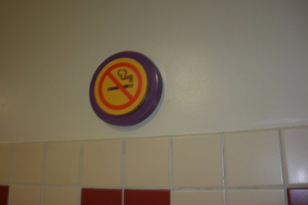
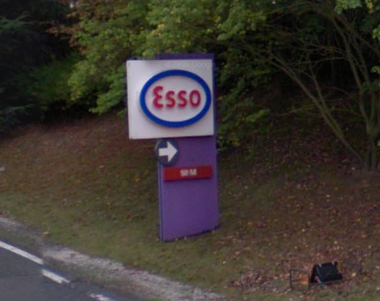
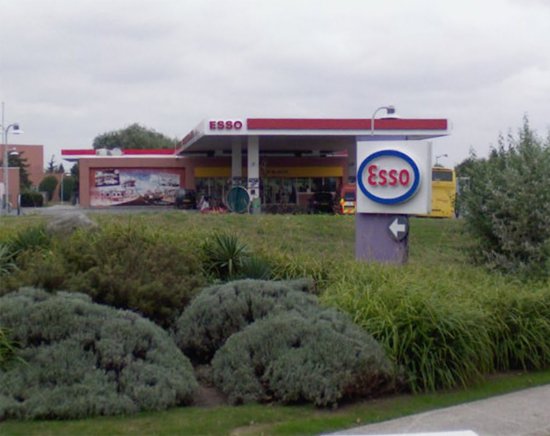
Today, only a few relics of the once omnipresent corporate design of Euro Disney remain: signs around Lake Disney, way finding signs in front of the railway station and Disney Hotels, signs in the restrooms of Disney Village and at the Esso Gas Station close to Disney’s Hotel Santa Fé.
Although it had its shortcomings, it cannot be denied that Euro Disney’s corporate design is timeless and that it has an aura of excitement and sophistication. Furthermore, back in 1992, it acted like the neutral, yet very colorful glue that held together all the different parts of the Euro Disney Resort experience.
Therefore, Disneyland Paris should consider the development of a new corporate design, that takes into account the strengths (and weaknesses) of the original S/P design. Here are some of my ideas for a new logo:
This article was written by Will . His fascination and appreciation for Disney started with the opening of Euro Disneyland in 1992. Coming from an American Cultural Studies background, Will today is most interested in the original concept of the Euro Disney Resort and the cultural messages that the Walt Disney Company wanted to convey about the United States back in the late 1980s. To Will, the 1992 Euro Disney complex is an outstanding example of postmodern architecture and culture, which should be maintained in and reconstructed to its original state as closely as possible. These concerns and interests lead the author to follow and support 'Designing Disney'. We would like to sincerely thank Will for the efforts that he has made in writing this marvelous article!