Corporate Design of Euro Disney Resort – Part 1
“Corporate design is part of corporate identity and refers to a company projecting a consistent, identifiable corporate image through its communication media, such as brochures, catalogs or packaging. This includes graphic elements, such as a distinctive company logo, the company's 'house colors' or a particular typeface. In many cases corporate design also encompasses product design and can even extend to include the architecture of the company building.“
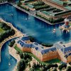
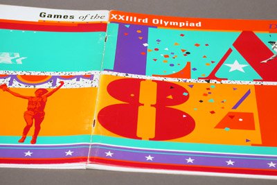
When Euro Disney Resort opened in 1992 it had a unique and colorful corporate design. In this essay, we discuss the initial logo and company colors of what is now called ‘Disneyland Paris’.
Who created Euro Disney’s corporate design?
On April 11, 1992, an article published in the Los Angeles Times stated that “Euro Disney is, well, California”. The article stressed that mostly companies from and around the ‘Golden State’ had been involved in the planning and creation of Euro Disney. One of them was ‘Sussman & Prejza’ (S/P), a provider of graphic and logo design services in Culver City, Los Angeles, California.

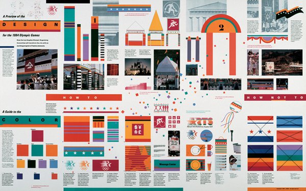
“Deborah Sussman’s work explores the intersection of graphic design and the built environment through the application of arresting images to public spaces. She spent formative years working in the office of Charles and Ray Eames, where she was involved in the design of major exhibits for IBM, the Ford Foundation, and the Government of India. Sussman opened her own studio in 1968 and was joined by her husband, urban planner and architect Paul Prejza, to form Sussman/Prejza in 1980. The firm is responsible for the celebrated graphics and environments for the 1984 Olympics in Los Angeles as well as signage and wayfinding for Walt Disney World and the City of Philadelphia, the public interior for Universal Studios Hollywood AMC Theatre, and identity, exhibits, print collateral, and signage for San Francisco’s Museum of the African Diaspora. Sussman was the recipient of SVA’s Masters Series award/exhibition in 1995.”
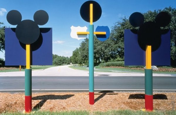
In the late eighties, S/P was asked by the Walt Disney Company to create a corporate design for their European project because their work for the Walt Disney World Resort had been highly successful and popular among guests.
A short article titled “Euro Disney Corporate Identity and Resort Signing” from the discontinued ‘Process: Architecture Magazine’ (#124 1995, p. 54-57) exactly sums up what S/P actually did for the Euro Disney Resort:
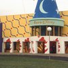
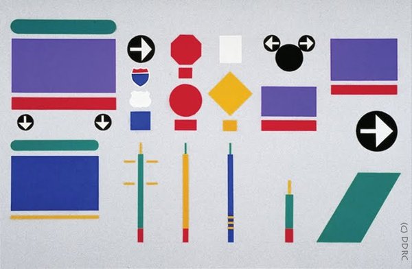
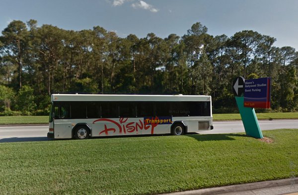
“Involvement with Euro Disney began with renaming the corporate entity and the redesign of its logo, which was introduced in the company’s bilingual 1990 annual report. In addition to the logo, the company introduced the ‘Disney palette’, based on the color scheme originally developed for Walt Disney World in Orlando, Florida. This corporate identity program was applied to numerous printed materials and products used to promote the 4,800 acre resort, and to the Euro Disney bus system. Sussman & Prejza also designed a resort-wide signing system and a bus-and-tram signing system that includes exterior bus graphics and interior finishes, bus station and bus stop signing, information points and maps. Directional, tram and regulatory signs assist pedestrians travelling between the lake front hotels and Euro Disney’s major theme park. Information points with maps provide information as strategic locations. The Disney bus system is distinctive and separates itself from other buses servicing the park. Interiors utilize the Disney palette and impart an air of excitement to the passengers.”
One of the first things S/P did, was inventing a new name for the project. In an interview for this article, Dan H. Evans – who worked in the 1990s as a junior designer at S/P on the Euro Disney assignment and who is now a professor of graphic design at Utah University – said that Disney originally referred to the project as ‘European Disneyland’. This formal name first appeared on very early documents, like site screening reports from 1984.
However, as planning began, the shorter ‘Euro Disneyland’ emerged and was broadly used by the Disney staff. But at S/P, they felt that the name was too long. Therefore, different shorter alternatives were suggested and discussed.
After several logo studies, where possible names were evaluated visually, it was agreed on that ‘land’ should be dropped. ‘Euro’ stayed as the word sounded exciting and interesting to the Americans involved in the discussions. ‘Resort’ was added to convey that the destination would be more then just a one-day-trip affair.
S/P argued that the French wouldn’t care much for the addition of ‘Paris’, as the destination wasn’t really in Paris anyway. In the end, the project was named ‘Euro Disney Resort’ and the company running the venture ‘Euro Disney SCA’.
What was part of Euro Disney’s corporate design?
The logo
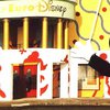
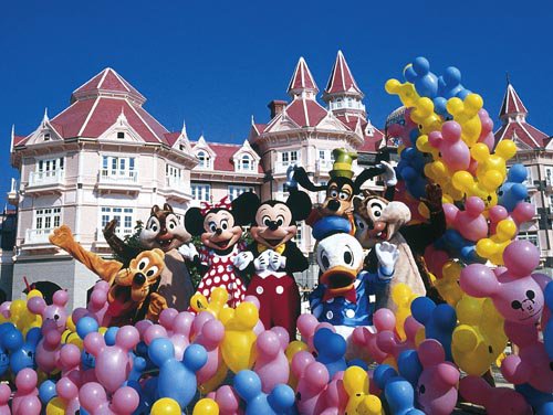
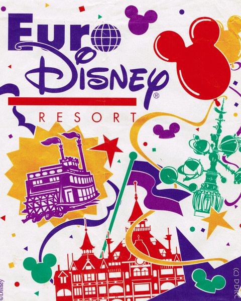
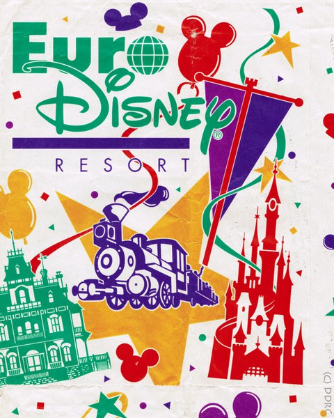
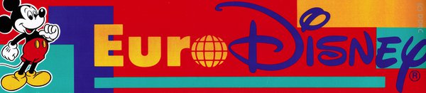
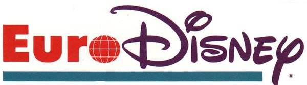
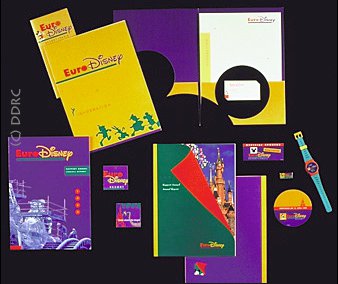
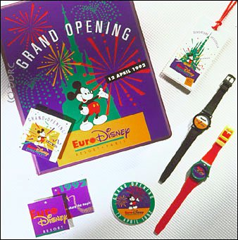
The first logos designed by S/P featured the words ‘Euro’ and ‘Disney’, underlined by a green stripe. The term ‘Euro’ was realized in red, using a variation of the ‘Futura Extra Bold’ font. ‘Disney’ was tinted purple. In front of these words, there was either a drawing of Mickey Mouse or a yellow square with the silhouette of its head and ears.
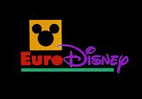
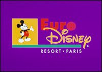
Deborah Sussman loved the ‘yellow square’ version while it was very well in line with the graphic design aesthetic of S/P. In spite of all that, both logos were valid. However, the ‘drawing version’ was used mostly as logo for the resort while the ‘yellow square’ version was more often used as the logo of ‘Euro Disney SCA’. There were side-by-side and stacked versions of the logo.
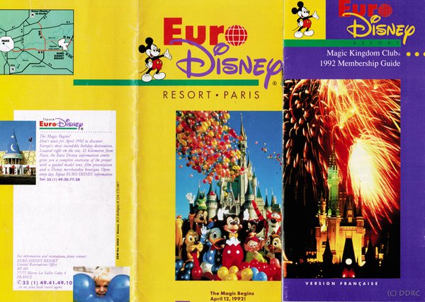
In the early nineties, S/P was asked by Disney to add the words “Resort Paris” to the design.
In addition, the “o” from ‘Euro’ needed to be replaced by a little globe. Dan H. Evans disliked this idea. He argued that the globe would damage the modern design of the reduced and graphic approach. However, Disney believed it would give the project an international aura, as the globe is the quintessential sign for internationalism.
There were lots of discussions on this topic. Evans recalls that there “were many chefs in the kitchen” at that time and that every tiny detail was discussed by many people. A lot was at stake for Disney and they wanted to get everything right and please everyone.
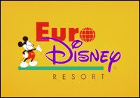
The final logo – to Evans – was too complex, overloaded and not strong enough. He believes that it was a watered down version of the original logo, which didn’t feature the words ‘Resort Paris’ and the playful globe.
The (Euro) Disney palette.
S/P developed a corporate color scheme for the Walt Disney Company before they worked on the Euro Disney project. The palette consisted of the colors of a classic Mickey Mouse image (black and white, red and yellow) and their complements (green for red, purple for yellow).
Complementary colors are hues that are opposite one another on the color wheel. These pairs complement each other because they both have different features and qualities. Each pair of complementary colors consists of a warm and a cold color plus a primary and secondary color. Red and yellow are both warm and primary colors, while purple and green are both cold and secondary colors. When placed next to each other, a pair of complements makes each other appear brighter, more intense.
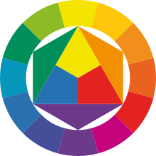
In case of the Disney Palette, not only one pair of complementary colors was used but three. This combination resulted in an incredibly vibrant and bold effect of colorfulness. This effects was pursued by S/P.
For the Euro Disney Resort, purple was pushed by S/P as the main color for the corporate design, as no other company at that time was using it. Coca Cola had red, IBM was using blue and Euro Disney’s signature color should become purple. Furthermore, the hue called forth the same associations as the Disney brand did (that is fun and entertainment).
And last but not least, it was the CEO’s (mister Michael Eisner) favorite color…
This article was written by Will. His fascination and appreciation for Disney started with the opening of Euro Disneyland in 1992. Coming from an American Cultural Studies background, Will today is most interested in the original concept of the Euro Disney Resort and the cultural messages that the Walt Disney Company wanted to convey about the United States back in the late 1980s. To Will, the 1992 Euro Disney complex is an outstanding example of postmodern architecture and culture, which should be maintained in and reconstructed to its original state as closely as possible. These concerns and interests lead the author to follow and support 'Designing Disney'. We would like to sincerely thank Will for the efforts that he has made in writing this marvelous article for us!